Get expert help in Responsive Web Layouts
Crafting modern web solutions with cutting-edge technologies and optimized performance.
Start Development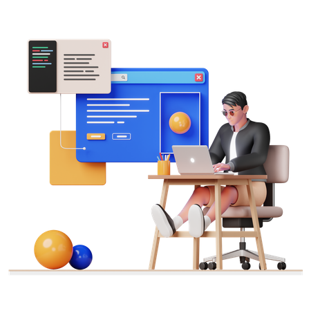
Crafting modern web solutions with cutting-edge technologies and optimized performance.
Start Development
We design fluid, breakpoint-driven layouts that prioritize mobile and tablet users, ensuring seamless content scaling, ergonomic thumb navigation, and pixel-perfect rendering across all viewports.
We implement modern `
Our code undergoes rigorous testing in all major browsers and adheres to WCAG standards, guaranteeing inclusive user experiences, semantic markup, and ARIA roles for every visitor.
Leveraging critical CSS inlining, code-splitting, and deferred script loading, we ensure sub-second render times, smooth interaction, and superior Lighthouse performance metrics across devices.
We begin with in-depth discussions to understand your brand, target audience, and design expectations for every screen size and device.
We design interactive wireframes and responsive UI layouts that adapt fluidly across breakpoints—mobile-first, always pixel-perfect.
Using semantic HTML and Tailwind CSS, we build fully responsive layouts that are optimized for speed, accessibility, and device fluidity.
After final testing, we launch to scalable cloud platforms, ensuring lightning-fast loading and perfect rendering across all screens.
Let's build something amazing together with clean, maintainable code.